A well-designed and well-written website can do wonders for amplifying the message and cause of your non-profit organisation. It is the foundation of your digital presence and can help maximise your reach, boost donor acquisition and retention, and generate well needed publicity. As a result, your organisation will be able to better engage with donors and pull in more support.
How good web design helps your non-profit
Before anything else, it’s important to understand how important good web design is. It can help send a message to your supporters, assuring them that your organisation is dynamic, modern, and financially healthy. It also creates a strong sense of professionalism, instilling confidence in donors wanting to make a contribution.
1. Helps tell your story
There are different people and personalities working behind a non-profit. However, the common thread that ties them together is the cause that they’re working towards. A website can emphasise that. The stories of the people they help, the cause they serve and the people working tirelessly behind the scenes.
2. Creates a positive impression
A website creates an impression and lets people know who you are and what you’re all about. You can add your mission statement, values and any relevant statistics about your cause.
It’s important to make sure that the impression you make encourages people to join and support your cause. If you don’t want your message to be undermined, your website has to be professionally produced and designed.
3. Expands reach
The internet allows anyone to access any information at any time. This has been proven true for individuals and businesses, and nonprofit organisations are no exception. If you want to reach out to a larger audience and make more people aware of the great things you do and plan to do, then share more online through your website. You can even make use of social media.
4. Gains attention
When it comes to nonprofit organisations, discourse is inevitable. A website is a great way to allow people to discuss different issues and help each other. It also attracts donors who believe in their cause.
5. Initiates conversion
The goal for nonprofit groups is always to achieve conversions. A website allows you to better raise awareness for your cause and increase the scope of your operations. From donations to volunteers, conversions keep nonprofit organisations thriving.
Key elements of non-profit web design

A lot goes into web design. However, user experience should always be at the forefront of your strategy. Focusing on the following key elements can help you accomplish this.
1. Feature engaging imagery
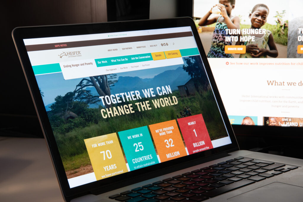
From the moment users land on your homepage, you should be able to captivate them with powerful imagery. A website should always contain compelling visuals to be effective. It’s a simple way to let your supporters know of the impact your organisation is making, which holds more weight than just simply telling them in words.
You can also strategically place visuals on your website to further your mission by evoking emotions in your users. It’s advisable to use photos you took yourself instead of generic stock photos. Authenticity is always important in a nonprofit organisation. Also, make sure to not overdo it and to keep the imagery minimal so you don’t distract the reader or turn them away from your site.
Make sure that every image serves a purpose. They’re a great way to support your content and break up the text on the page. Whatever your mission is, it’s important for your images to effectively communicate this to your visitors.
2. Optimise the mobile experience
Studies have shown that almost 80% of all internet access is done through mobile phones. With this, it’s important for your non-profit website to be functional on all devices. When users are unable to properly view your site on their phone, this can frustrate them and convince them to leave your site without a second thought.
3. Consider Search Engines
Your website needs to be visible and easily searchable online if you want to further increase the awareness around your organisation. You’ve most likely heard of the term SEO which is short for Search Engine Optimisation. Basically, SEO is the optimisation of the content on your site so it ranks prominently on popular search engines like Google. SEO is a big topic and it is worth searching through Youtube to learn about it or engage the help of a digital marketing agency.
4. Focus on smooth navigation
The structure of your nonprofit website is a major part of user experience design. Intuitive navigation can help your audience find what they need as quickly as possible.
Intuitive navigation starts with a visible navigation bar. Then, simplify the interface of your website by adding calls-to-action (or CTAs) and well labeled buttons.
When designing your navigation bar, here are a few suggestions to achieve a more intuitive interface:
- Make sure your navigation titles do not exceed three words.
- Stick to only one drop-down menu level when needed.
- Use simple language and avoid jargon or complex language that does not portray the content of your landing page clearly.
5. Minimise load time
Keeping your site as speedy as possible is one way you can enhance the user experience. You can achieve this by getting rid of any extraneous elements. The more elements there are on your site, the longer it takes for it to load. Users typically won’t wait more than a few seconds for your site to load. If your website can’t deliver immediate results, then they’ll likely move to another site that can.
Features to include

The following are the core features that every nonprofit website should have:
1. Modern and mobile-friendly design
Communicating with your audience is the primary purpose of your website. This means that it should feature a design that’s easy to use and conveys information as directly and clearly as possible. Prioritising a design that works on mobile also helps with SEO, enhancing the visibility of your site.
2. Focus on accessibility
You have the responsibility to make sure that all of your potential audience members can access your website, including those using assistive technology or living with disabilities. For instance, you can take additional measures to make your website friendly to users who are:
- Blind or visually impaired
- Not able to use a traditional mouse or keyboard
- Are deaf or hard-of-hearing
- Not able to access a high-speed internet connection
For more on this see our post, Web Accessibility: Making Your Website Accessible to Everyone
3. Email sign-up form
An email sign-up form should be one of the most prominent CTAs on your site. Organisations typically place a simple email sign-up form in the sitewide footer, as well as other more targeted locations on your site. Capturing a user’s email means you can continue to communicate with them after they have left your site.
4. Clear call-to-action buttons
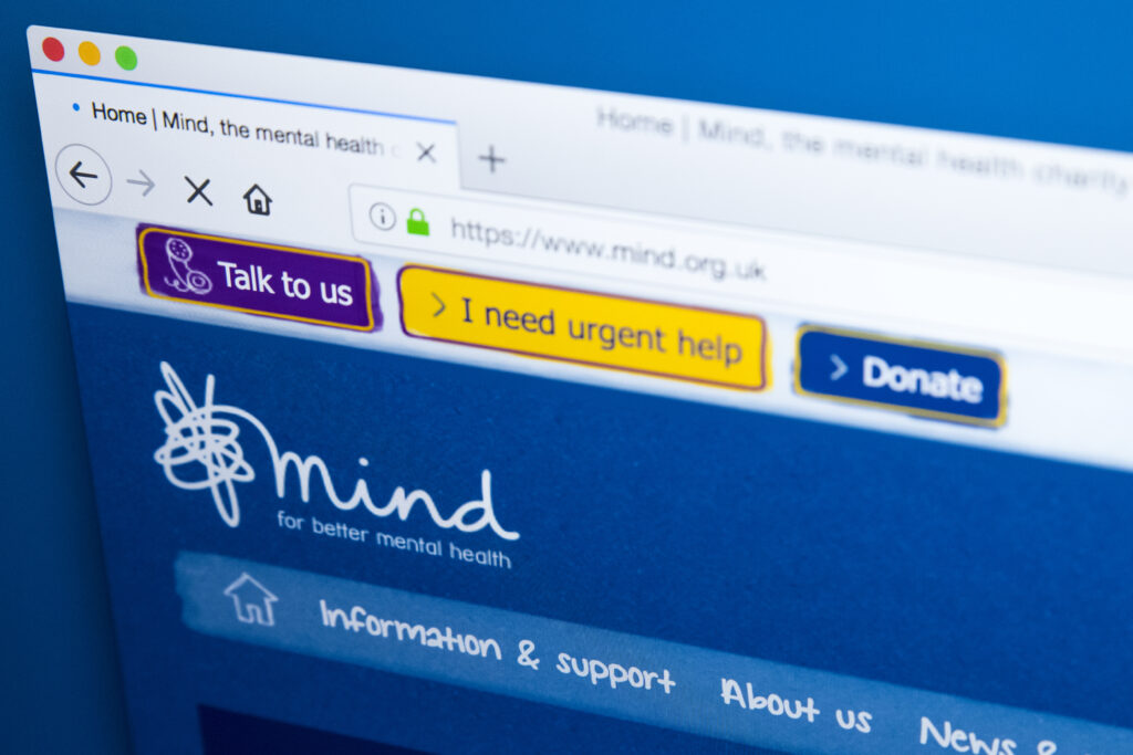
Make sure that the design of your website encourages users to take action. Nonprofit websites usually have a “Donate” button in the main navigation. Other CTA buttons you can add include volunteer application forms, event registration forms, or completing an advocacy action like contacting their local MP or signing a petition.
5. Collect analytics data
You need to be collecting information about how visitors found your site, the pages they visit and what actions they’re performing. There are different tools you can use to collect website analytics but the main one is Google Analytics. It is important to configure these so that they capture information about certain key events like when someone donates or completes an online form. You can then analyse this information to see if there are any patterns such as a tendency for a particular demographic or readers of a certain blog post making large donations.
6. Search functionality
On large websites, it’s important for users to be able to just search for what they need on your site. You can include a search icon or search bar on your site, allowing users to make use of another method to find the content that they need.
As a website owner, this also helps you figure out the terms users search for the most. This can help with the development of new content and features.
7. Social media buttons
Add a link to your social channels on your site so users know of an easier way to reach you. This also helps search engines understand how your website is connected to other sources of information about your organisation online.
8. Privacy policy and cookie consent
Make sure that your website complies with any privacy law. Every website that collects user information, even something as simple as an email form, should have a privacy policy in place, as well as a cookie consent notice.
Pages to include

Now that you’re aware of what features should be incorporated into your web design, it’s time to move to the actual content of your website. What should users expect to find on your website? What pages should be included?
1. Pages describing initiatives and their impact
Nonprofit websites should have at least one page dedicated to describing what they do and the impact of their work. This can be one page or a cluster of pages that describe two or three different programs. The important part is that it relays how your organisation works to make an impact.
Some organisations use these pages as an entry point for visitors interested in using their services. For instance, organisations that run a community food shelf will have to differentiate between pages that offer services to food-insecure community members and pages that describe their impact and solicit donations.
2. About page
Of course, you can’t leave out the page that describes our organisation. As a nonprofit organisation, a mission and vision statement should be included on this page. You can also include details about the origin of your organisation and its history. Some stats are also a great way to show your impact.
3. Blog or news updates
Keeping your audience up to date on the work of your organisation is important. How will they be able to trust your words if they don’t see any action? A blog or a “news” section is a great way to provide updates. Not to mention, regularly publishing blog posts builds up authority and enhances your site’s visibility through content marketing.
Blog or news posts can also provide valuable content that can be promoted on social media channels or in an email newsletter.
4. Donation page
If your organisation accepts donations, then it is critical to have a donation page on your website. This page should have a compelling copy that convinces visitors to donate, as well as a donation form that’s easy to use and lets users provide their personal and payment information in just a few simple steps. There are lots of third party services like JustGiving and Go Fund Me that your website can interact with to take one-off or regular donations.
Your donation page should also disclose whether donations are tax-deductible and provide an easy method for the user to allow this tax saving to be passed onto you.
5. Get involved pages
There are some visitors that may have opened your website, hoping to be part of the work you do. You should explain clearly what opportunities are available for them. Consider collecting information by using a specific volunteer intake form.
6. Events calendar
If you occasionally organise events, then an events page should be present on your website. Individual event pages should have the title of the event, description, time, date, location or link and, if applicable, details on how to register.
7. Staff and board directory
Your donors and supporters will want to get to know the people behind your organisation. You should include a staff directory with information about each member of your organisation. If appropriate, you can also include information about each member of the Board of Directors.
8. Contact page
Make sure you have a contact page so visitors know how to keep in touch with you. This page can include:
- Contact form for sending inquiries to a central inbox
- Mailing address
- Phone number
- If applicable, physical address along with a map location and clear directions
9. Resource library and case studies
Larger nonprofit organisations tend to develop collections of content that are better organised as a library for easy sorting, filtering and searching. Some examples of non-profit libraries include:
- Resource libraries that contain educational content such as webinar recordings, guides or fact sheets
- Action library that shows opportunities for participating in online advocacy, depending on your geographic area and what issue you are passionate about
- Story library that showcases the works of the organisation and its impact
Final words
Having a strong design for your non-profit website can achieve a lot more than you might think. The design of your website greatly affects visitor’s first impressions of your organisation as a whole. Not to mention, it can directly influence their decision of whether or not they plan on continuing to interact with your organisation and end up donating or volunteering for your cause.
Of course, building and maintaining a website is no walk in the park and is a continuous process of improvement. Here at Blue Llama we specialise in NPO websites and would be happy to talk to anyone needing help on their website journey.

