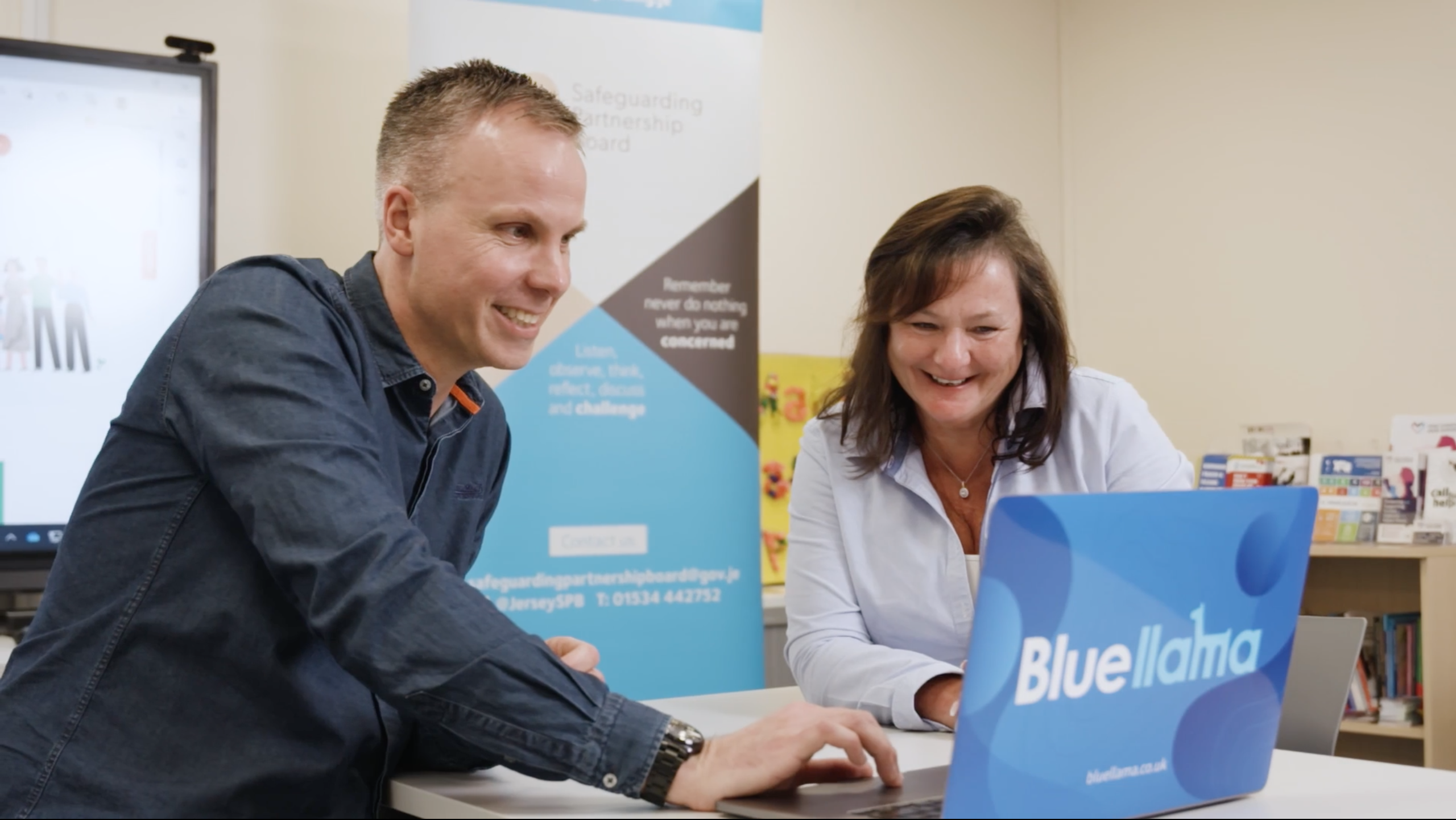
At Blue Llama, we firmly believe that simplicity and user-centric design are the keys to creating impactful digital experiences for website visitors. But when it comes to nonprofit organisations (NPOs) that often need to serve diverse communities, we believe that the importance of user-centric design becomes even more critical – and can be the difference between serving your community, or failing them!
Shining a spotlight on a recent project we completed for the Safeguarding Partnership Board (SPB) we’re going to showcase why we believe user-centric design is vital for nonprofit websites. But before we do that…
How does your website stack up?
As you reflect on your own organisation’s website, here are some key questions to consider:
1. Is your website designed with accessibility in mind? Have you taken steps to ensure that individuals with disabilities or impairments can navigate your website easily?
2. How can you improve the efficiency of delivering services through your website? Are there opportunities to integrate systems or automate processes to save time and resources?
3. Are your resources easily accessible? Have you implemented features like document libraries and powerful search functions to help users find information quickly?
4. Does your website demonstrate sensitivity to your community’s needs? Have you considered alternative visual elements or illustrations to create a welcoming and inclusive online environment?
Let’s dive in!
How to make your safeguarding site serve the whole community:
The Jersey Safeguarding Partnership Board plays a crucial role in protecting children and vulnerable adults from harm, abuse, and neglect. With a wide range of audiences, including professionals, individuals at risk, and concerned citizens, the SPB’s website needed to effectively convey information to various users. Our team was tasked with developing a website that was super simple, clean, and clear, ensuring that anyone could easily find the information they needed quickly.
Focus #1: Accessibility
One of the key challenges we faced was ensuring accessibility for all users, including those with disabilities or impairments. To address this, we carefully selected simple fonts and colours that would assist people with visual impairments. Instead of relying solely on photography, we opted for illustrations that conveyed a positive and inclusive representation of the sensitive subject matter. By prioritising accessibility, we made sure that individuals with diverse needs could navigate the website with ease.
Impact: the website has seen an increase in mobile traffic by 70%
Focus #2: Efficiency
Efficiency was another crucial aspect of the SPB’s website. As part of their mission, the SPB delivers training to various stakeholders. To facilitate this process, we integrated a suitable Learning Management System (LMS) into their website. This LMS enabled individuals to easily book training sessions while allowing the SPB team to manage bookings and delegates efficiently. By automating tasks like waiting lists, certificates, and reminders, we streamlined the training delivery process, saving valuable time and resources for the SPB.
Focus #3: Organisation
Additionally, we recognised the importance of making information easily accessible, especially since the SPB provides a significant amount of resources in PDFs and Word documents. To address this, we implemented a comprehensive document library on the new website. The documents were categorised logically, allowing visitors to find what they needed effortlessly. We also integrated a sophisticated search facility that could index within PDFs, ensuring that even information buried within documents was easily discoverable.
Impact: There has been a reduction in training time by 40%
We understand that collating the information which needs to be accessible to communities can feel daunting, but when it comes to breaking this down into manageable chunks, our team are particularly great!
We are really keen to help UK Safeguarding Partnerships. We want to help organisations better serve their communities – and we do this by making digital simple.
If you’re looking to enhance your organisation’s digital presence, let’s talk!


